

The Editing Company
The Editing Company
Toronto, Ontario
Toronto, Ontario
Telephone: (416) 924-3856
RECENT POSTS


TEC Blog
Categories
Show All- Editing
- Grammar
- Usage
- Style
- Editor/writer
- Publishing
- Business
- Writing
- Writers support group
- Event
- Proofreading
- Copyright and permissions
- Usage
- Book reviews
- Editing new media
- Technology
- Books & libraries
- Ttc stories
- Editing & marketing
- Office happenings
- Social media & community
- Language & editing
- Social media
- Editing & marketing
- Indexing
- Book design
- Tec clients
- Guest blogger
- Creative women doing sixty
- Book clubs
- Books and reading
- Ebook technology & services
- Editing numbers
- Editing & technologies
- Opera, movies
A Brief History of the Pilcrow: A Worldly Mark on Proofreading
by Michael Bedford
Published at 2021-10-06
The ways that linguistic conventions change over time are sometimes obvious. New dialects and turns of phrase crop up, and many of them gradually change their meaning. Contextual changes throughout history often drive this kind of linguistic shift, but linguistic conventions also change in a subtler way. For instance, changes to the ways words are spelled tend to favour shortening rather than lengthening, presumably because people prefer short words that are easy to spell. Similar instincts, it seems, are behind the rise, fall, and slight return of the pilcrow (¶), a current-day proofreaders’ mark with an impressive pedigree.
Why Is It Called A “Pilcrow”?
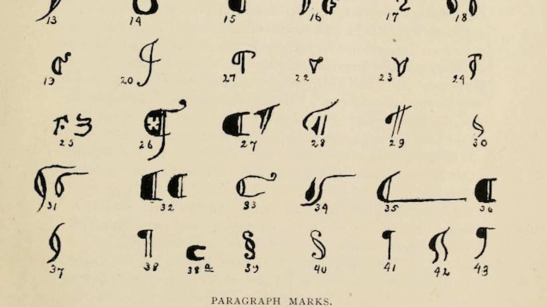
The pilcrow’s original Greek form, a simple horizontal line in the left margin of texts, was called a paragraphos. Subsequent symbols representing the paragraphos, including the pilcrow, were translated into Old French as paragraphe and then pelagraphe. The Middle English word pylcrafte turns up in the mid-15th century. Even more arbitrary than the centuries-long change that turned paragraphos into “pilcrow,” though, is the scattered development of the contemporary symbol representing the pilcrow (¶).
Going Kaput
Starting out as a horizontal line, the symbol representing the paragraphos evolved into the Greek letter Gamma (Γ/γ). Using Gamma as a notation gave way to using the Latin word kaput, signified with “K”, meaning “head.” This trend in turn gave way to using the Latin word capitulum, or “little head,” symbolized with a “C.” Using the capitulum became standard practice in the 12th century, and, probably a side-effect of the capitulum’s relationship with illuminated manuscripts, the “C” representing capitulum gained a couple of frills, such as the addition of one or two vertical lines, many of which were also filled in with red or black ink, finally giving us the modern-day version of the pilcrow.
From Mainstay Mark to Proofreader’s Punctuation
Of course, the pilcrow doesn’t grace each page of our contemporary publications, telling us whenever a new paragraph has started. Instead, a 1.25" indentation is the standard. Illustrating how the printing press changed the nature of publishing from reverent act of faith that produced unique pieces of art into streamlined method of mass production, essayists Tschichold and Bringhurst claim that indentations were originally left as blank spaces so that rubricators could provide pilcrows after books were printed. However, rubricators couldn’t keep up with publishers’ demands, so books were often sent to market before the pilcrows were added. Eventually, the book-buying public became accustomed to the lack of pilcrows, and the historically integral punctuation mark became much harder to find.
The Persistent Pilcrow
Nowadays, pilcrows are used for slightly different purposes. One of their main functions is still to point out paragraph breaks, but instead of being used by printers, pilcrows are used by proofreaders to point out where there ought to be a paragraph break. In fact, the symbol is such a large part of proofreading that Microsoft Word uses the pilcrow as the symbol to turn review mode on and off. (If you go to the paragraph panel under the “Home” tab and click on the pilcrow in the upper-right-hand corner of that panel, it will display the pilcrow at the paragraph breaks!)
The pilcrow has also found a contemporary home in web publishing style guides, as an identifier for “anchor links.” The pilcrow is also used in legal correspondence when referring to specific paragraphs within a legal document. And, in keeping with the background of the pilcrow’s holy origins on the pages of illuminated manuscripts, you can even find it in some church bulletins, indicating when parishioners should take some kind of action, for example, stand, sing, pray.
Another Casualty of Linguistic Convention
Changes to linguistic convention have done away with more than just the traditional use of the pilcrow, though. One of my favourite forgotten symbols is the letter “thorn” (Þ, þ), which makes the same sound as the combination of “T” and “H.” Eventually, this ancient letter, originally a Germanic rune, gave way to the construction “th.” The only place one still finds the letter “thorn” in circulation is in Iceland.
There are several ancient letters and symbols out there that are either disappearing or have already disappeared. Check out this article for information on a few more, including a fascinating story about the ampersand and its eventual exclusion from the alphabet.
Note: The image above is from pilcrows and other paragraph marks in Edwin Lewis’s History of the English Paragraph (1894). Image courtesy of the archive.org as found in “The Evolution of Punctuating Paragraphs through 5 Specific Markers” by Keith Houston (October 2015).
Michael Bedford is a freelance editor, copywriter, and performer living in Stoney Creek, Ontario. He can be reached at https://mgb-editor.com/.
Want a monthly editing tip? Sign up for our monthly newsletter and have helpful editing tips delivered directly to your inbox.