

The Editing Company
The Editing Company
Toronto, Ontario
Toronto, Ontario
Telephone: (416) 924-3856
RECENT POSTS


TEC Blog
Categories
Show All- Editing
- Grammar
- Usage
- Style
- Editor/writer
- Publishing
- Business
- Writing
- Writers support group
- Event
- Proofreading
- Copyright and permissions
- Usage
- Book reviews
- Editing new media
- Technology
- Books & libraries
- Ttc stories
- Editing & marketing
- Office happenings
- Social media & community
- Language & editing
- Social media
- Editing & marketing
- Indexing
- Book design
- Tec clients
- Guest blogger
- Creative women doing sixty
- Book clubs
- Books and reading
- Ebook technology & services
- Editing numbers
- Editing & technologies
- Opera, movies

To Err is Human: Take Book Covers, for Example
by Barbara Kamienski
Published at 2018-02-22
They say you can’t judge a book by its cover. Really? While the saying may be metaphorically true, in a literal sense, as any book publishing professional can tell you, if a book cover doesn’t give you a pretty good idea of what’s inside, it has failed. A book cover’s visual appeal needs to be such that any prospective book buyer can see at a glance that the book is a must-have. The cover, in other words, is a crucial marketing tool.
Design: Get It Right
In a reputable publishing house, the job of creating book covers falls to the art department. Armed with a description of a book’s contents and target audience, the book designer is given the task of creating a cover that immediately communicates the book’s substance and tone.
To this end, infinite care is given to the process, and the sales and marketing departments weigh in on every design submitted. (I once shared an office with a highly talented book designer, whose ability was matched only by her patience as draft after draft was returned to her for a seemingly endless series of changes and tweaks.)
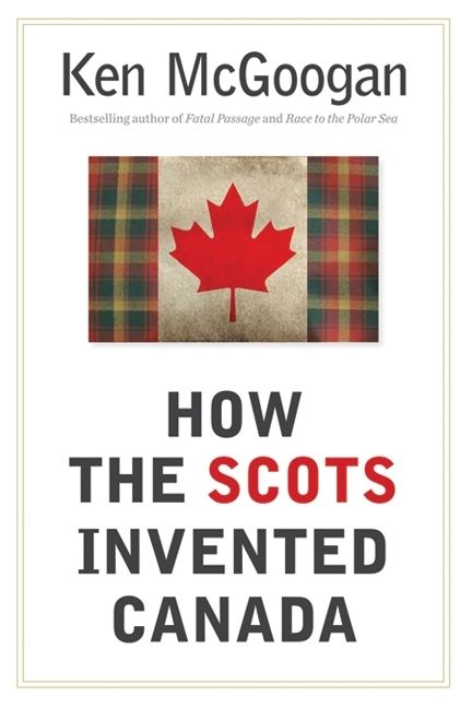
Good cover design is a delight. A couple of examples that spring randomly to mind are, for instance, Ken McGoogan’s How the Scots Invented Canada (2010, HarperCollins) or Samuel Totten’s Dirty Hands and Vicious Deeds (2018, University of Toronto Press). In each case, one look at the cover and you can’t wait to start reading.
Bad cover design? Oh dear. Google “bad book covers” or “crummy book covers” and you’ll see what I mean. Some are so bad that they’re downright hilarious.
Text: No Typos Please!
Google “book cover typos” and you’ll find plenty of examples of typos. Interestingly, though, virtually all of them will be from the interiors of books, not their covers. This, despite the fact that the interior text will have been copyedited and proofread and possibly even given a “cold read,” all in the interests of accuracy and consistency.
However, publishers are painfully aware that because the text on the cover—title and subtitle, author’s name, synopsis, author’s bio, blurbs, and so on—will have been assembled from various sources, it is especially accident-prone. The cover will be passed around to be pored over by as many sets of eyes as possible; the more eyes, the greater the chance that, for instance, the extra “l” in “thrillling” may be caught before the file goes to the printer. Still …
Some Typos Always Slip Through
The subtitle of TV personality Charlotte Crosby’s 2017 autobiography, Brand New Me, initially contained the word “Stonger”— but the error was caught in time.
But instances of flat-out cover typos that make it to press are rare. On the cover of Iwo Cyprian Pogonowski’s 1983 Dictionary, Polish-English, English-Polish (2nd ed.), the author’s surname is rendered as Pognowski on the front cover, but it’s correct on the spine—and on the covers of subsequent editions.
Some errors are more subtle. For instance, the blurb on the front cover of Jordan Peterson’s recently released 12 Rules for Life describes the author as “one of the most important thinkers to emerge on the world stage for many years.” Surely that should read “in many years”?
And here’s a weird one: in the title of Tony Judt’s excellent 2006 book Postwar: A History of Europe since 1945, the word “postwar” is not hyphenated. In the book’s interior text, however, it is consistently rendered as “post-war”. (Admittedly, this is probably irritating to only a small number of readers.)
Great Times
What can we learn from all of this? If you derive pleasure from finding typos and other errors in books and on their covers, these are, as Virginia Heffernan of the New York Times pointed out, great times. But if you’re striving for as few errors as possible in a text of your own: hire an editor!

